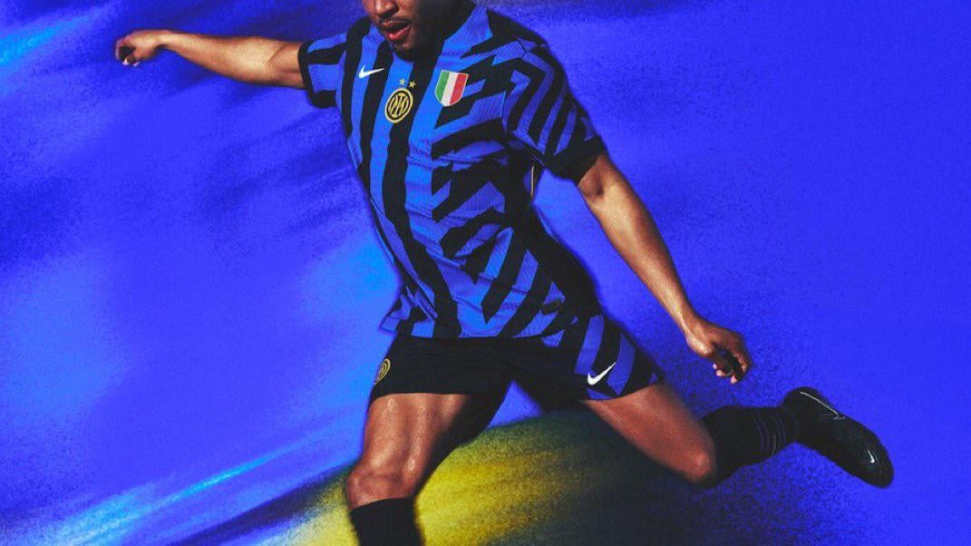
“Celebrating the city’s bold architecture, the home shirt features a bold geometric pattern, which disrupts the traditional vertical stripe design, bringing shapes inspired by the city’s unique skyline – remixed to reflect the connection Milan holds with design”
by Foshyyy
11 comments
I mean, I guess… But I don’t have to like it!
I see nothing about the skylines in the jerseys. Are the skylines in Milan falling over?
Barf
i must’ve been to the wrong Milano last year. Because i don’t recognize the skyline from the jersey
What about Bosco *Verticale*? Does it ring a bell, Nike?
i’ve seen someone post a view of the ramps leading to the second floor of San Siro, looking the same as the “odd side” of the shirt. makes a lot more sense like that.
Yeeeeeah…. suuuuuure
Fuck it, I’m just gonna say it. I like the jersey. It’s so extreme and nonsensical that’s it’s entered the realm of campiness(is that the correct word?). It’s like the 1990 Germany kit. It’s so wild that it has become an icon of German football. It’s the Adam West Batman of Football kits.
Vertical stripes when you’re playing and again vertical if you’re fucking. I like it.
I had a look around, and Milan isn’t *quite* the best looking city in the world.
Fuck it, I don’t mind it at all