[OC] Mortality Rate for 20-24 Age Group Posted by n0tpc Tags:DataData Is BeautifulDataIsBeautiful 9 comments Source : UN inter agency for Mortality Estimation [per 1000] The hot spots are all warzones China should be red as fuck Why is greenland bigger than Africa? So we have data proof that woman live longer than men This is a really confusing graphic. 32 per how many? WHY is neutral gray the higher number???? ::Squints accusingly at Afghanistan and Central African Republic:: So women live longer than men everywhere but Afghanistan A diverging colour scale implies significance of the midpoint and is a confusing choice here Leave a ReplyYou must be logged in to post a comment.
![[OC] Mortality Rate for 20-24 Age Group](https://www.europesays.com/wp-content/uploads/2024/09/vr2qugn73vpd1-1012x1024.jpeg)
9 comments
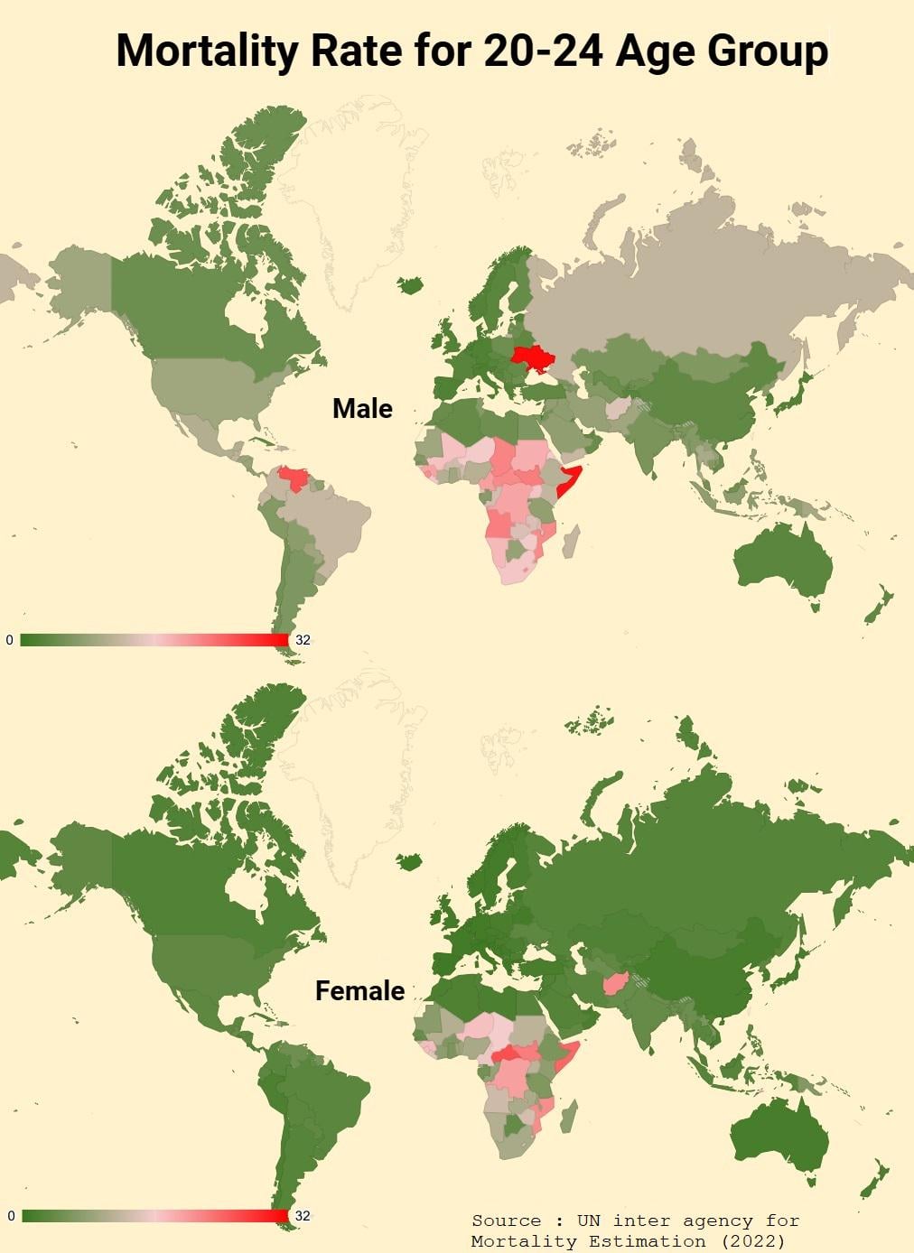
Source : UN inter agency for Mortality Estimation
[per 1000]
The hot spots are all warzones
China should be red as fuck
Why is greenland bigger than Africa?
So we have data proof that woman live longer than men
This is a really confusing graphic. 32 per how many? WHY is neutral gray the higher number????
::Squints accusingly at Afghanistan and Central African Republic::
So women live longer than men everywhere but Afghanistan
A diverging colour scale implies significance of the midpoint and is a confusing choice here