Wonder if they’ll do a version without the sponsor
The pants make it better somehow, now I think it’s cool in a trashy way
This kit has grown on me over the past few months and now I like it.
RIP fashion
Not sure why most people in this sub were having a cry about this design. Looks awesome. Compare this to last season’s one and it’s light years better.
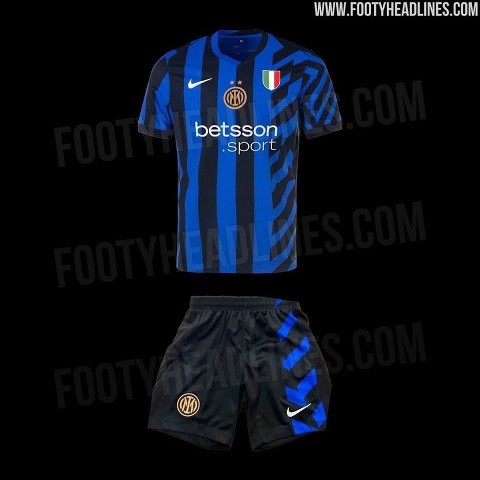
Am I the only one thrown off by the location of the logo and scudetto?
Aren’t they typically flipped?
non symmetrical design is ugly as hell, like seeing a person with a disfigured face
Swap the scudetto and the badge. There’s a lot of competing ideas here but a middle badge with this kind of symmetry doesn’t make a lot design sense.
I thought it was pajamas after reading pants..
My biggest complaint isn’t even the design, it’s the sponsor. Betsson looks so fucking shit
100% not gonna buy it. You can add even a million stars to the crest. Won’t buy it. That central badge seems so off
Horrible Jersey 😕
I mean, I can get behind that. The first leaks were definitely worse than this, now the shade of blue is really nice and the badges are at least centered. The asymmetrical design looks a lot better with the pants, they give a sense of continuity to the whole kit. The sponsor is actually the thing I like the least but my eyes will somehow get used to it.
Still terrible.cant we for once win a scudetto and have a nice jersey afterwards?
I always hate central badges. It NEVER looks good. Also betting ads are the worst. Ah well.
When is actually coming out. Hoping by next Sunday as I’m heading to Milan with my boys
Ugly as fuck guess the ugliest jersey I’ve ever Seen! And the shorts are even worse
All these people hating on it, I hope I can find it on sale eventually lol
If it wasn’t for the scudetto badge and the second star, this would have been such hot garbage
I dig the pants
and that’s about it
For a kit that is supposed to be a best seller since it’s the first with two stars… It sucks
Shit
Old badge!?
For years there has been no point in expecting any positivity from the fanbase when it comes to the home hit.
Shorts are cool
Need to see on the players.. dont like th flip between the crest and the scudeto
Need to see on the players.. dont like th flip between the crest and the scudeto
It all depends on how it looks on the players for me
But right now I’m leaning towards just getting the away.
I think this vertical/diagonal stripe obsession could have worked, but it doesn’t look good here, and I’m not a fan of flipping the badge and the Scudetto
Someone was trying too hard to justify their pay check. All they had to do was vertical black and blue, and keep the Scudetto front and center
28 comments
Wonder if they’ll do a version without the sponsor
The pants make it better somehow, now I think it’s cool in a trashy way
This kit has grown on me over the past few months and now I like it.
RIP fashion
Not sure why most people in this sub were having a cry about this design. Looks awesome. Compare this to last season’s one and it’s light years better.
Am I the only one thrown off by the location of the logo and scudetto?
Aren’t they typically flipped?
non symmetrical design is ugly as hell, like seeing a person with a disfigured face
Swap the scudetto and the badge. There’s a lot of competing ideas here but a middle badge with this kind of symmetry doesn’t make a lot design sense.
I thought it was pajamas after reading pants..
My biggest complaint isn’t even the design, it’s the sponsor. Betsson looks so fucking shit
100% not gonna buy it. You can add even a million stars to the crest. Won’t buy it. That central badge seems so off
Horrible Jersey 😕
I mean, I can get behind that. The first leaks were definitely worse than this, now the shade of blue is really nice and the badges are at least centered. The asymmetrical design looks a lot better with the pants, they give a sense of continuity to the whole kit. The sponsor is actually the thing I like the least but my eyes will somehow get used to it.
Still terrible.cant we for once win a scudetto and have a nice jersey afterwards?
I always hate central badges. It NEVER looks good. Also betting ads are the worst. Ah well.
When is actually coming out. Hoping by next Sunday as I’m heading to Milan with my boys
Ugly as fuck guess the ugliest jersey I’ve ever Seen! And the shorts are even worse
All these people hating on it, I hope I can find it on sale eventually lol
If it wasn’t for the scudetto badge and the second star, this would have been such hot garbage
I dig the pants
and that’s about it
For a kit that is supposed to be a best seller since it’s the first with two stars… It sucks
Shit
Old badge!?
For years there has been no point in expecting any positivity from the fanbase when it comes to the home hit.
Shorts are cool
Need to see on the players.. dont like th flip between the crest and the scudeto
Need to see on the players.. dont like th flip between the crest and the scudeto
It all depends on how it looks on the players for me
But right now I’m leaning towards just getting the away.
I think this vertical/diagonal stripe obsession could have worked, but it doesn’t look good here, and I’m not a fan of flipping the badge and the Scudetto
Someone was trying too hard to justify their pay check. All they had to do was vertical black and blue, and keep the Scudetto front and center