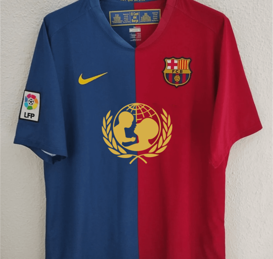
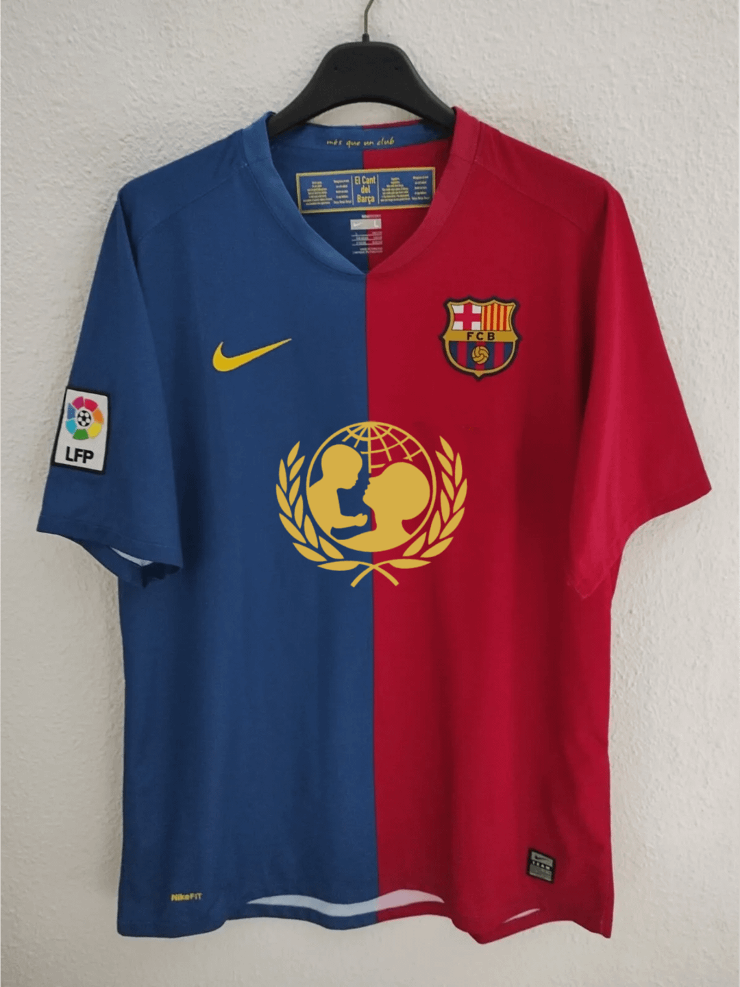
Hate 24/25 split sleeve colors, should do it like 1st picture or 08/09
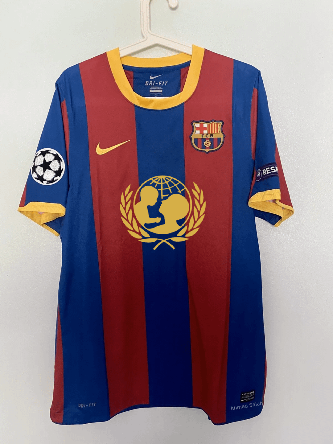
CL winning kits
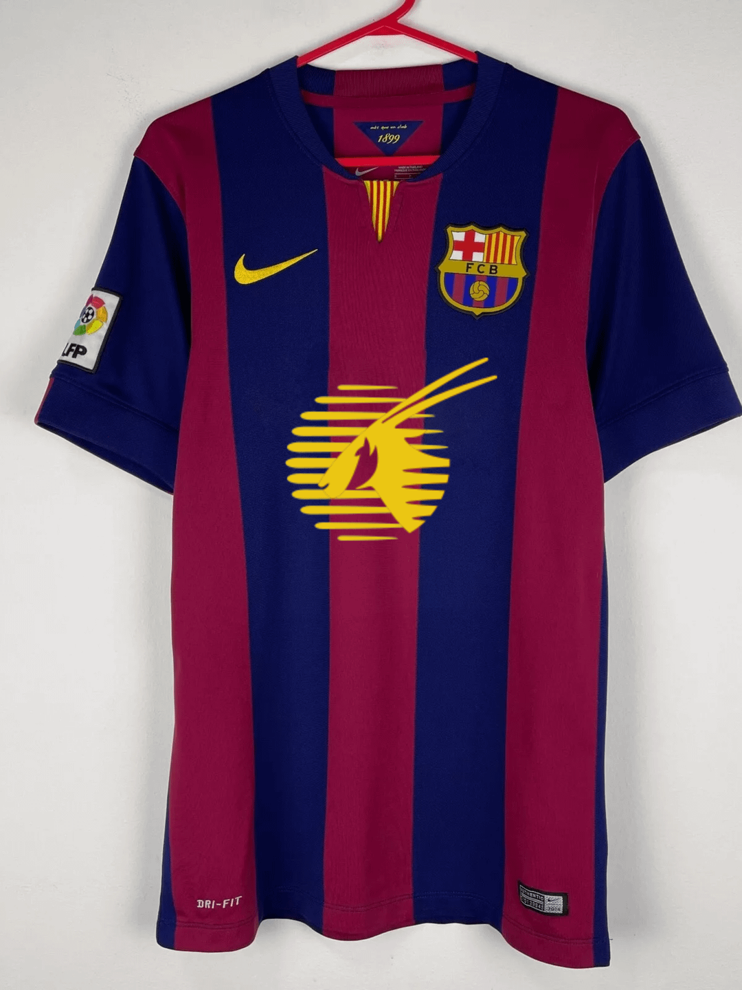
the crest should’ve been on the right for this year’s kit, I won’t mind the big ass Spotify logo but right now I just don’t like it, maybe it will grow on me
The crest makes no sense being in the middle. Could’ve been a nice one if it was properly placed.
the big UNICEF logo looked so special back then, not a soulless corporation but a humanitarian organization.
7 comments
The first two look clean af
Hate 24/25 split sleeve colors, should do it like 1st picture or 08/09
CL winning kits
the crest should’ve been on the right for this year’s kit, I won’t mind the big ass Spotify logo
but right now I just don’t like it, maybe it will grow on me
The crest makes no sense being in the middle. Could’ve been a nice one if it was properly placed.
the big UNICEF logo looked so special back then, not a soulless corporation but a humanitarian organization.
What season are the first two shirts?