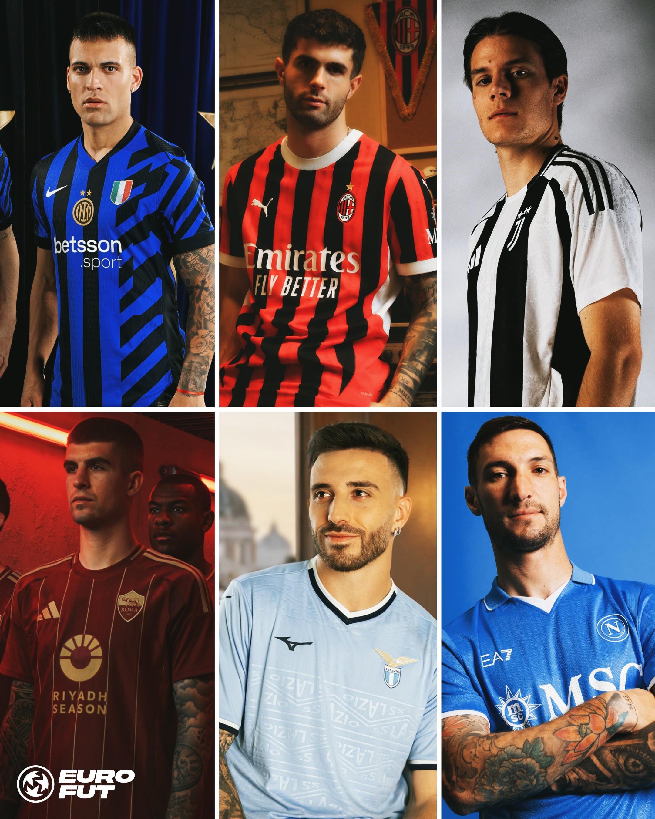
Seriously, how hard is it to make just simple stripes?
Them trying to justify their mess by saying it’s inspired by Milan skyline makes it even worse.
Roma kit is fire tho
Looks better than Milan’s tbh
I like the kit
I don’t love it. Don’t hate it.
I dislike the scudetto not in the middle more than the horizontal stripes.
With that said, I just bought it.
I disagree, it is new, fresh and different. Sometimes change is good.
Two stars and I’m not getting the kit. Fuck’em.
Nike is on a quest to make the worst kit on the market
Chill the fuck out. It’s fine. Every year… EVERY YEAR you babies throw a fit as if you have any say in their design. Get used to change, the only true constant is that home is black and blue. Buy retro kits if you crave them that much. We’re not getting collars or long sleeves either, but I ain’t throwing a bitchfit about it…
Looks like something an edgy teenager would come up with. Total bush league.
It’s ugly af
I don’t hate it.
Honestly it’s still better than Juve’s away kit
Have you guys seen it? Straight up looks like someone pissed on it
Im still waiting for the day they drop Nike and go with Kappa
It depends on how the season will end up. If we’ll win something big, this will go down in history as a great kit.
I wanna buy all serie a kits this season
I really like it though. If anything, the worst thing is the sponsor. All of the kits in this image look awesome imo.
I think on the pitch with the full kit it will look decent.
Why are the Adidas ones ALWAYS nice and Nike is it here running Picasso designs
FFS! If Nike want to experiment with our kit, then they should do it with the 3rd gear… Call me conservative, but all I want are the simple black and a blue vertical stripes on our home kit; no more, no less.
21 comments
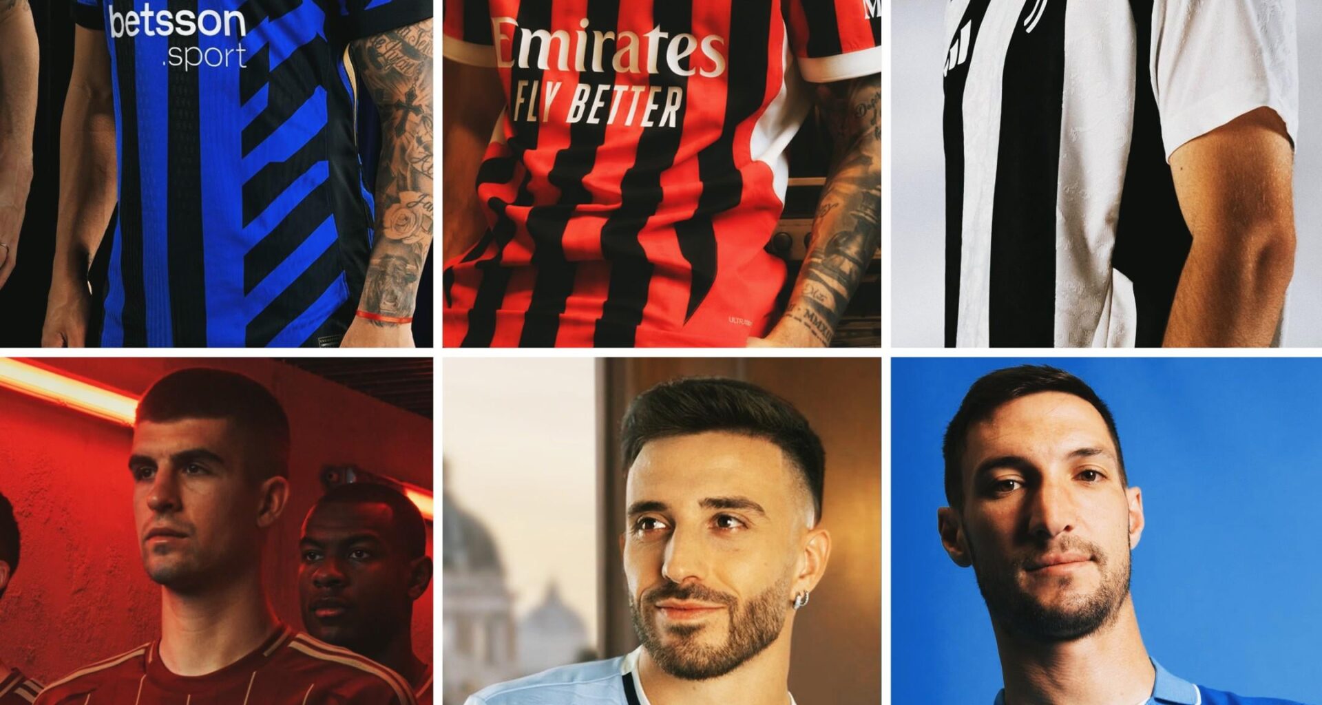
Seriously, how hard is it to make just simple stripes?
Them trying to justify their mess by saying it’s inspired by Milan skyline makes it even worse.
Roma kit is fire tho
Looks better than Milan’s tbh
I like the kit
I don’t love it. Don’t hate it.
I dislike the scudetto not in the middle more than the horizontal stripes.
With that said, I just bought it.
I disagree, it is new, fresh and different. Sometimes change is good.
Two stars and I’m not getting the kit. Fuck’em.
Nike is on a quest to make the worst kit on the market
Chill the fuck out. It’s fine. Every year… EVERY YEAR you babies throw a fit as if you have any say in their design. Get used to change, the only true constant is that home is black and blue. Buy retro kits if you crave them that much. We’re not getting collars or long sleeves either, but I ain’t throwing a bitchfit about it…
Looks like something an edgy teenager would come up with. Total bush league.
It’s ugly af
I don’t hate it.
Honestly it’s still better than Juve’s away kit
Have you guys seen it? Straight up looks like someone pissed on it
Im still waiting for the day they drop Nike and go with Kappa
It depends on how the season will end up. If we’ll win something big, this will go down in history as a great kit.
I wanna buy all serie a kits this season
I really like it though. If anything, the worst thing is the sponsor. All of the kits in this image look awesome imo.
I think on the pitch with the full kit it will look decent.
But all I can think of is this:
https://preview.redd.it/ao4zjx9vbbed1.jpeg?width=739&format=pjpg&auto=webp&s=1f6f53f95c71ffa0032b571a674f0a855f98c3ba
The Lazio kit is dog shit ngl
Why are the Adidas ones ALWAYS nice and Nike is it here running Picasso designs
FFS! If Nike want to experiment with our kit, then they should do it with the 3rd gear… Call me conservative, but all I want are the simple black and a blue vertical stripes on our home kit; no more, no less.