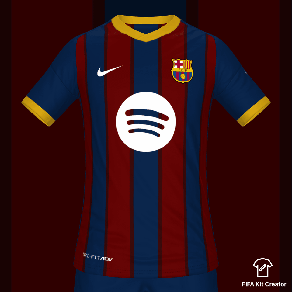
Forgot to add the catalan flag like tag at the back.
Bring back the red shorts again, please.
Levante kit looking fire
Great! Just two notes. I think the nike logo and the spotify logo should be the same yellow as the sleeves and collar. Also the spotify logo is too large. I hope Barça goes back to how the logo was the last two seasons.
Looks pretty good.
Love it!
Looks like the kit from 2013/14 season.
Dude its the same kit design from 2010/11 and 20/21. 😂 Design something out of the box bruh.
8 comments
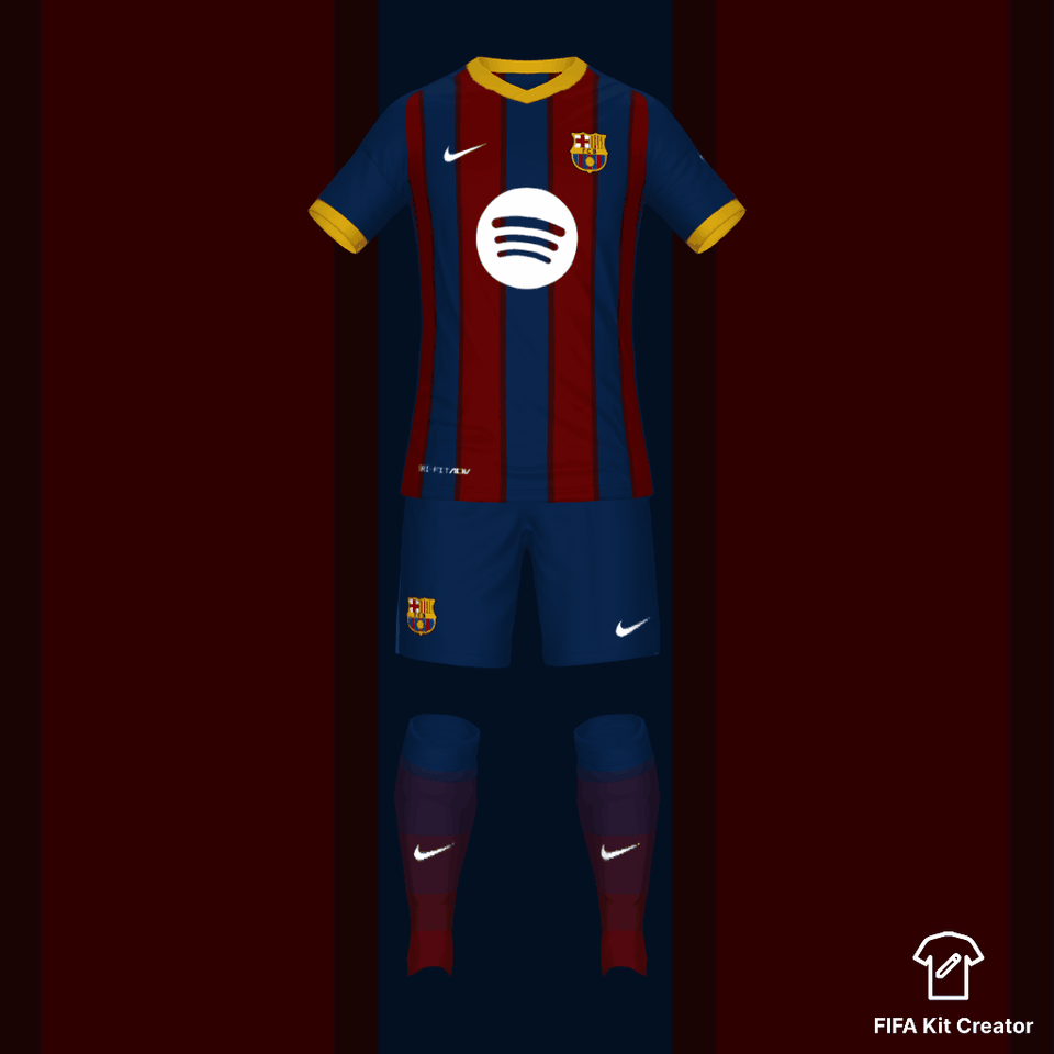
Forgot to add the catalan flag like tag at the back.
Bring back the red shorts again, please.
Levante kit looking fire
Great! Just two notes. I think the nike logo and the spotify logo should be the same yellow as the sleeves and collar. Also the spotify logo is too large. I hope Barça goes back to how the logo was the last two seasons.
Looks pretty good.
Love it!
Looks like the kit from 2013/14 season.
Dude its the same kit design from 2010/11 and 20/21. 😂
Design something out of the box bruh.
Beautiful 🤌🏻